|
MAS965: Social Visualization Prof. Judith Donath Assignment 9 - Maps and Metaphors Nov 23, 2004 Francis Lam |
|
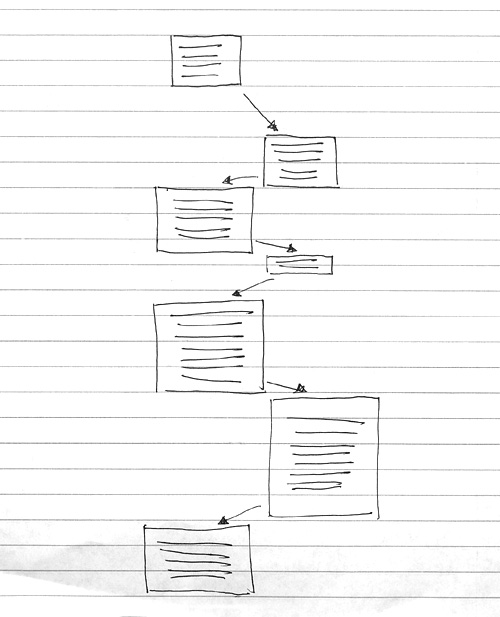
Compare your Cambridge/Boston map to an accurate geographical one. What are the differences in the layout of the space? Why do you think they occurred? How does your method of transportation affect how you see the city? Your school? Your friends? What makes the city legible – or not? As a newcomer in town, my mental map of both cities is closely tied with my personal ideas and experiences of the city rather than the stereotypes that I have exposed to. My hand-drawn map shows a dominating detail of the MIT campus which indeed takes over almost 90% of the space in Cambridge and 40% in total. This could be implied by the fact that I am having most of my time at MIT and my student experience actually occupies my idea about the city. Also, those buildings are placed in the center of the map as they were first being drawn from there, they are probably the uppermost in my mind when I think of the city. Furthermore, the entire map is upside-down as compare to the accurate map which has Boston printed below the Charles River. This orientation mismatch is probably because of my actual walking habit, I normally walk from Cambridge to Boston, the slight slope to the bridge make me always feel like I am going up to Boston and it reflects in the spatial layout of my map. The shape of the river is drawn by how I perceive it when I walk across the bridge. I think the river a straight line as it flows through the cities; it is similar to the subjects, who mistook Seine in the same way, in the study of Paris by Milgram et al. The sharp bend of the Charles River at the Cambridge port is not experienced when I stand on the bridge, that's why the curvature of the river is eliminated in my drawing. Nevertheless, the river is still a prominent element because it sets the border of two cities and acts as a reference line for the distances of the buildings from both sides of the river. Although the locations of Harvard Square and Porter Square are misplaced (Harvard square should come before Porter Square), the alignment of Central, Harvard and Porter as a line is mainly because of the subway station map. The way I travel around the city shapes its map in my mind. The landmarks I marked are somewhere I have been to or emotionally attached to (Stata Center and Simmons Hall). However, apart from those places, I also marked some places where I have no feeling upon, such as the Prudential building and the Common Wealth Park. They are included because they are my perception of the icons representing both cities. In red, I highlighted the places where I live, work, eat and hangout with friends, their appearance in the map is based upon my personal life and they are soaked in my memories and meanings – even it's a very short period of time. Those places are also able to create a spatial structure with the surrounding areas. The distance from my dorm to the Mass. Ave. and the location of Newbury Street, where my favorite restaurant resides, are all structuralized in the map by my frequently visited places. I think structure makes the city legible. In spite of the inaccuracy of the mental map, it is still legible if all the landmarks and places are structured in a reasonable way. The orientations of the elements form a basic spatial layout of the city, and then we are able to read the map if the image is coherent with the primarily concept of the city or falls along the same line of our own meaning and memory of the city. In your map of a discussion space, how did you choose what was at the top of the page, and what on the bottom? How did you use size? Would the map work equally well with top and bottom reversed? What about left and right? Is there meaning to proximity? Is anything inside anything else? Are there other metaphoric uses of space or representation you can see in your map?  In this quick sketch, I depict my email discussion with a friend with the most recent message floating at the top and the starting message on the bottom. The size of the text box represents the size of the message and the vertical distance represents the time difference between two messages. The messages on the left are mine and on the right my friend's. The map would still work with top and bottom reversed, but the meaning would be different. With the current layout, "up" means new, which also implies important, while "down" is old and the less important. When it's reversed, "up" is metaphorically linked with the first or the starter while "down" means the last, representing the last email we have exchanged. The left-right setting does not have a very significant effect on we comprehend the information, but I tend to put the important figure on the left, in this example my email messages, that probably due to my left-flushed writing habit. The proximity of the text boxes uses other metaphors to represent the spatial settings. Further apart is longer in time, and closer together is shorter in time. It also means the level of correspondence, the closer two message boxes are, the more highly corresponded the messages tend to be. To conclude, we can use different metaphors to represent different spatial meanings, and the spatial arrangement of information on a piece of paper can change how we perceive them. |